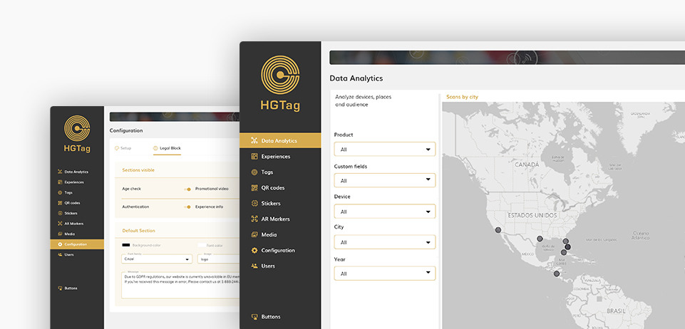
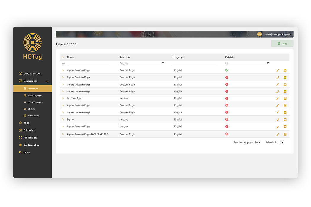
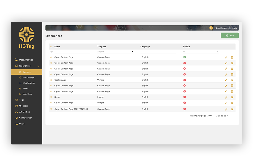
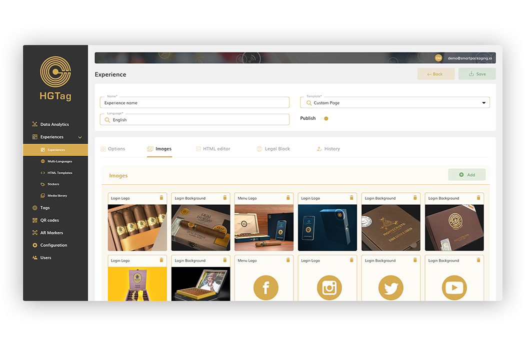
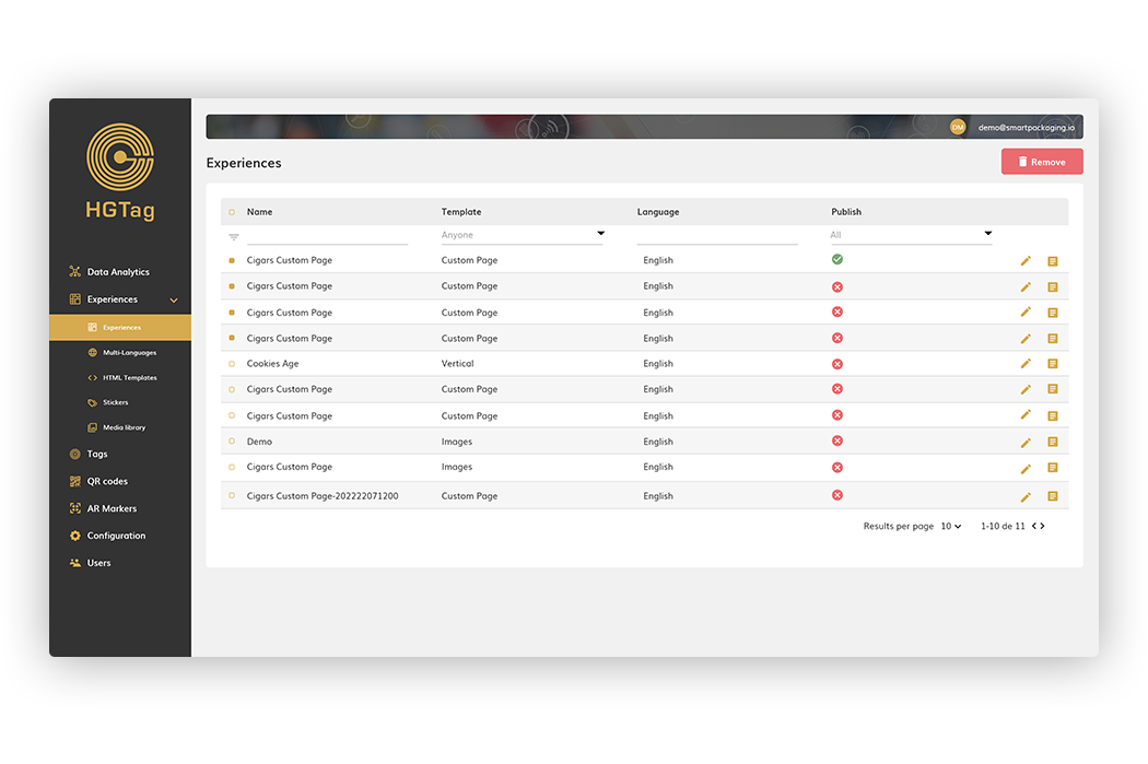
The Experiences section allows you to manage the platform experiences: shows/edit, add and delete experiences.
By default, 10 experiences per page are displayed, being able to move to another page or modify the display per page from the pagination at the bottom of the list.
You can also filter the data in the list by the name of the experience, type of template, language or whether or not the experience is Published.
From the main list we can:
1. Create new experience (detailed in next section).
2. Edit existing experience (detailed in next section).
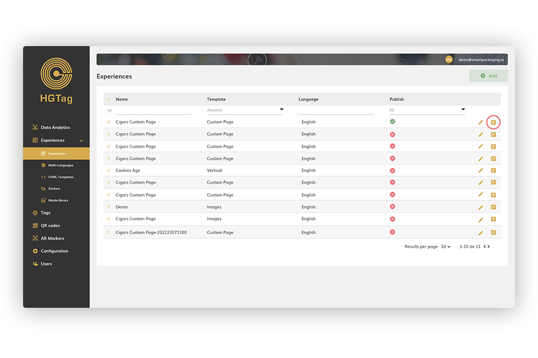
3. Duplicate an experience: for this, it will be enough to press the duplicate button
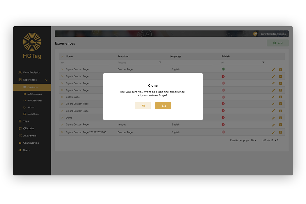
After accepting in the popup shown, the experience will be cloned.
For the creation of an experience, we will use the Add button that we have on the right side of the header:
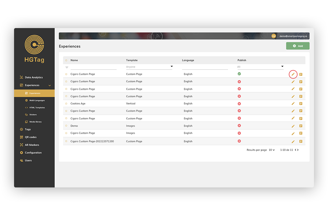
And for editing, we will directly give the Edit button of the experience to edit:
The rest of the functionalities are common for both creation or editing.
The first feature to indicate in an experience, in addition to the name, is the type of template we will use. We have:
Custom Page: template that activates the HTML Editor to make a design tailored to the experience.
Images: template with fixed format. Multiple images can be added and displayed in tag order.
Vertical: Template with fixed format. It fixes the image indicated in VerticalLeft.
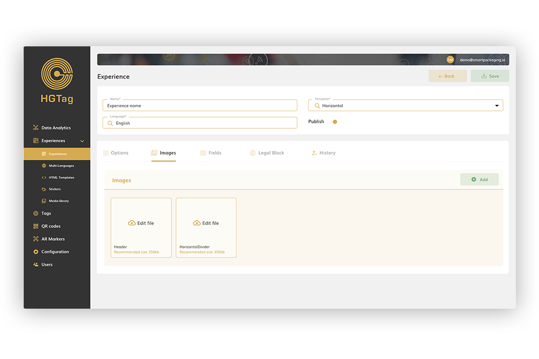
Horizontal: template with fixed format. It puts two images still: Header and HorizontalDivider.
Redirect: template that is simply a redirect to a webpage.
In addition to the name and template, the common data to indicate in any experience are:
Language: language of experience.
Publish: to indicate whether it is published or not. In case of “NO” being published, qr or tags can be created to scan them and see how the experience is going, but these scans will not be taken into account for analytics.
By the time an experience is already Publish, all the scans will be counted.
Below are the different tabs visible in editing an experience:
Visible tab in any type of template, but depending on the type, some blocks or others will be displayed. These blocks configure each of the pages that will show the experience when scanning it.
The templates with fixed format are: Images, Vertical and Horizontal.
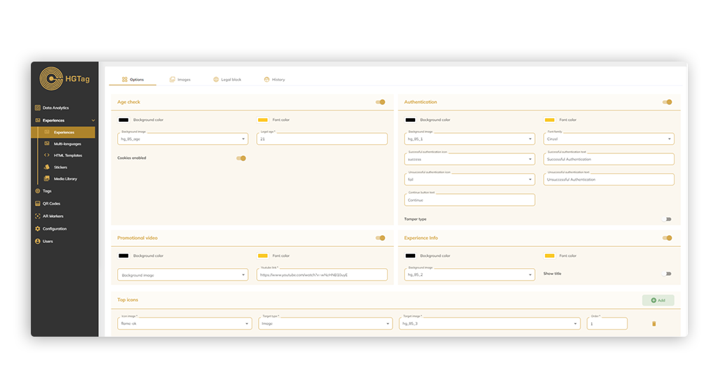
They all share the same options on the edit screen:
Age Check
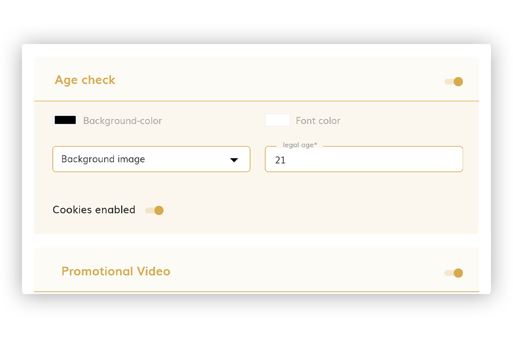
Page for the user to validate their age and can continue to see the experience. For this page we can configure:
• Check ‘Age check’: to make this page visible or not in the experience.
• Background color—Indicates the background color of the page.
• Font color—Indicates the color of the letter.
• Background image: allows you to select as the background of the page an image of those added in the Images tab.
• Legal Age: allows you to indicate the legal age to be able to continue with the experience.
• Cookies Enabled: enable/disable the acceptance of cookies.
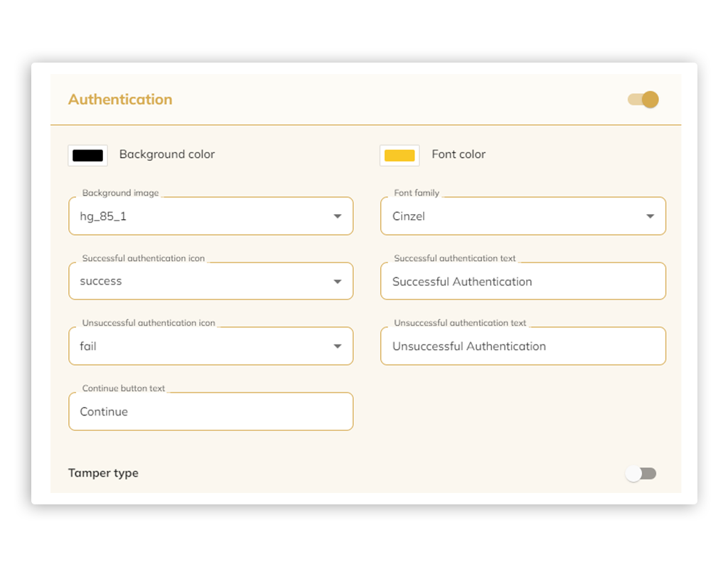
Authentication
Page for the authentication of the scan (page that only makes sense if you are going to create tags).
• Check ‘Authentication’: to make this page visible or not in the experience.
• Background color: Indicates the background color of the page.
• Font color: Indicates the color of the letter.
• Background image: allows you to select as the background of the page an image of those added in the Images tab.
• Font family: allows you to select a font for your text displayed.
•Successful authentication icon: Select an image from the images tab to display as an icon when the authentication is successful.
• Successful authentication text: Text to display on the page when the authentication is successful.
• Unsuccessful authentication icon: Select an image from the images tab to display as an icon when the authentication is not successful.
• Unsuccessful authentication text: Text to display on the page when the authentication is not successful.
• Continue button text: Text to display on the button to continue to the next page of the experience.
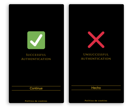
Examples:
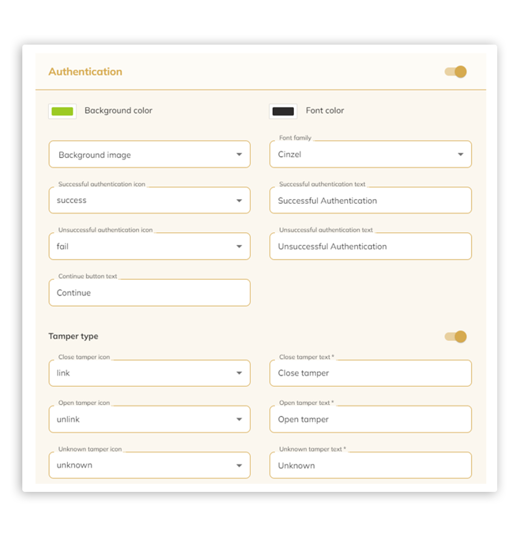
• Check ‘Tamper type’: Select the “toggle” to activate or deactivate the Tamper Type to the right of “Tamper Type”. Tamper Tags are designed to detect and authenticate a packaged or sealed product.
When Tamper Type is active, more fields will appear, to configure the authentication page as shown below:
• Close Tamper Icon: Select an image from the images tab to display as an icon when the tamper tag has not been tampered with or open.
• Close Tamper Text: Text to display on the page when the tag has not been tampered with or open.
• Open Tamper Icon: Select an image from the images tab to display as an icon when the tamper tag has been tampered with or opened.
• Open Tamper Text: Text to display on the page when the tag has been tampered with or opened.
• Unknown Tamper Icon: Select an image from the images tab to display as an icon when the status of the tamper tag is unknown. Any manipulation of tampering of the tag cannot be detected.
• Unknown Tamper Text: Text to display on the screen when any manipulation or tampering of the tag cannot be detected
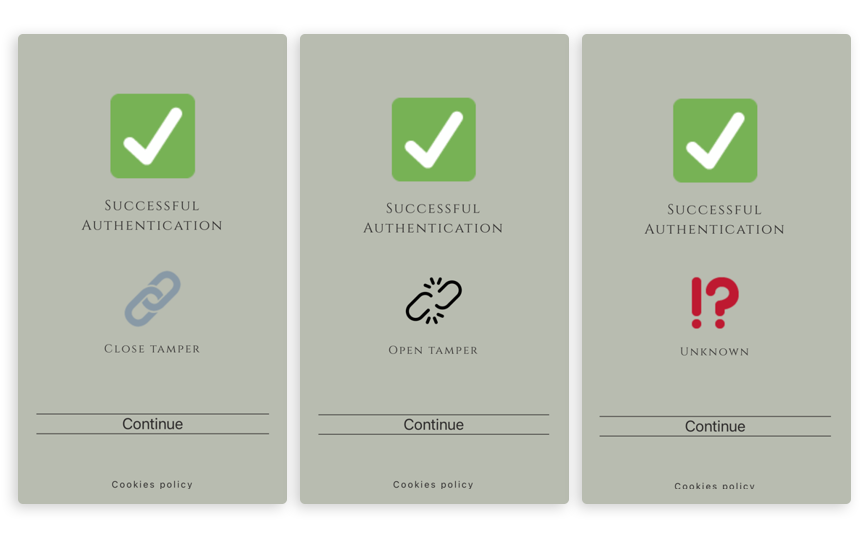
Examples:
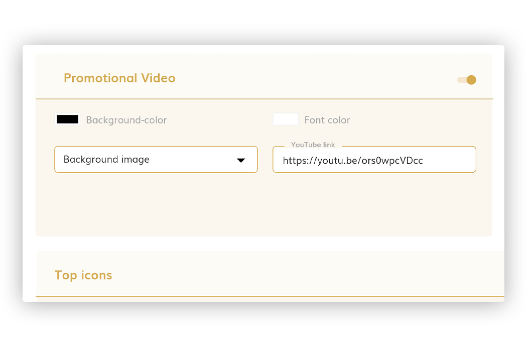
Promotional Video
Page that allows you to view a video in the experience:
• Promotional Video: to make this page visible or not in the experience.
• Background color—Indicates the background color of the page.
• Font color—Indicates the color of the letter.
• Background image: allows you to select as the background of the page an image of those added in the Images tab.
• Youtube Link: to indicate the URL of the Youtube video that will be displayed in the experience.
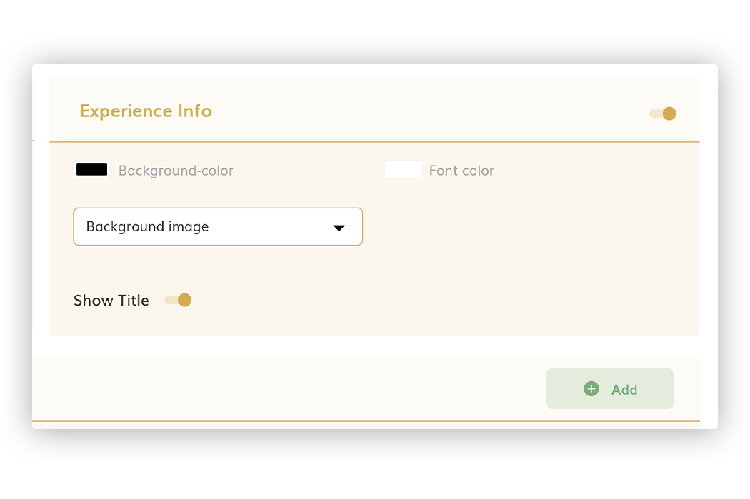
Experience Info
Page that allows you to view one or more images in the experience.
• Experience Info: to make this page visible or not in the experience.
• Background color—Indicates the background color of the page.
• Font color— Indicates the color of the letter.
• Background image (*4): allows you to select as the background of the page an image of those added in the Images tab.
• Show Title: to show/hide the title on the page. If enabled, the title displayed is the name of the experience.
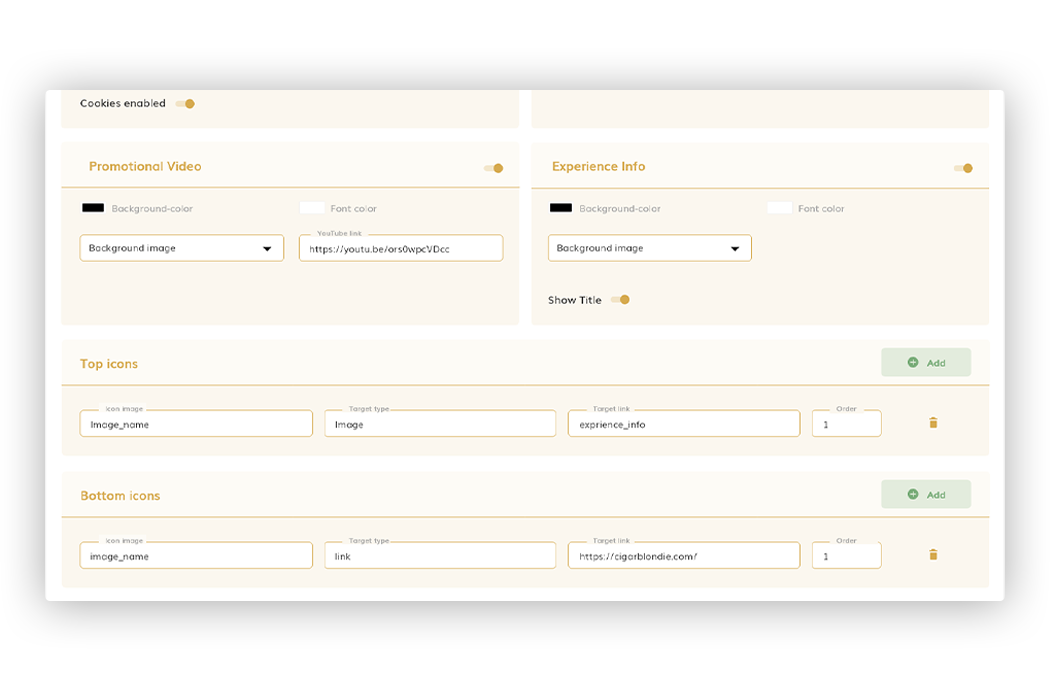
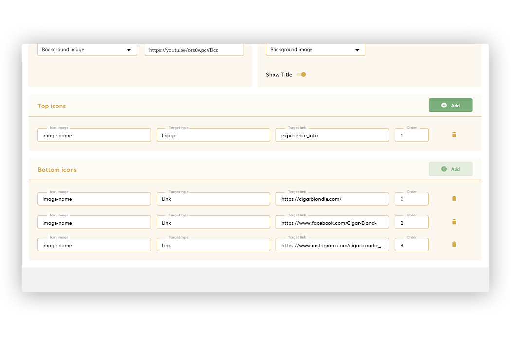
Top/Bottom Icons
Section that allows you to add icons at the top and bottom of the Experience Info page.
To add, it is enough to press the Add button. The data to indicate for each icon are:
• Icon image: you have to select which will be the image of the icon (the drop-down shows the images that are uploaded in the Images tab).
• Target type: you have to choose between:
1. Image: clicking on the icon will open an image (indicated in the target image)
2. Link: clicking on the icon will open a new link (indicated in the target link)
• Target link/target image: field to select the image to open or indicate the URL to open.
• Order: order in which the icon will be displayed (we can have more than one).
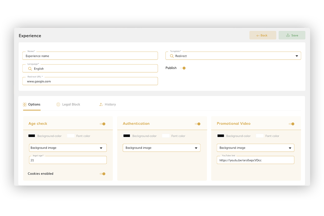
The template Redirect shows only 3 blocks in the ‘Options’ tab, since the template does a redirect to a web page:
When selecting such a template, it will be mandatory to report the Redirect URL field.
After scanning an experience, before going to the indicated URL, the blocks of age check, authentication and/or Promotional Video will be displayed in the case that they have been activated. If none are activated, the scan will take you directly to the web page.
Age Check
Page for the user to validate their age and can continue to see the experience. For this page we can configure:
• Check ‘Age check’: to make this page visible or not in the experience.
• Background color—Indicates the background color of the page.
• Font color—Indicates the color of the letter.
• Background image: allows you to select as the background of the page an image of those added in the ‘Images’ tab.
• Legal Age: allows you to indicate the legal age to be able to continue with the experience.
• Cookies Enabled: enable/disable the acceptance of cookies.
Authentication
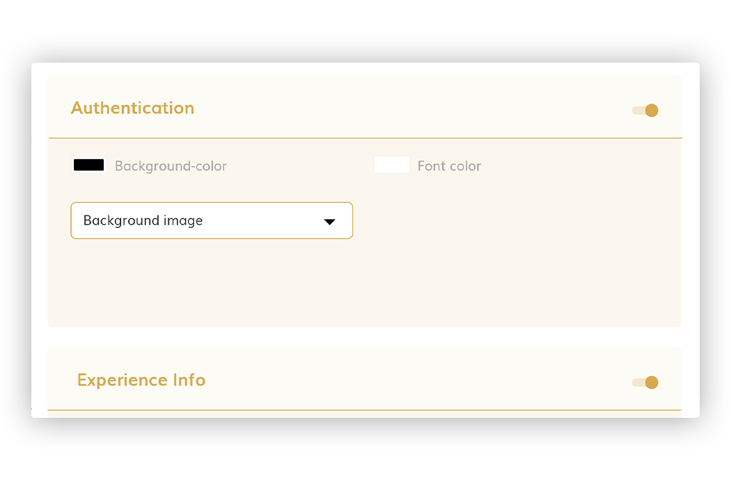
Page for the authentication of the scan (page that only makes sense if you are going to create tags).
• Check ‘Authentication’: to make this page visible or not in the experience.
• Background color: Indicates the background color of the page.
• Font color: Indicates the color of the letter.
• Background image: allows you to select as the background of the page an image of those added in the Images tab.
• Font family: allows you to select a font for your text displayed.
•Successful authentication icon: Select an image from the images tab to display as an icon when the authentication is successful.
• Successful authentication text: Text to display on the page when the authentication is successful.
• Unsuccessful authentication icon: Select an image from the images tab to display as an icon when the authentication is not successful.
• Unsuccessful authentication text: Text to display on the page when the authentication is not successful.
• Continue button text: Text to display on the button to continue to the next page of the experience.
Examples:
• Check ‘Tamper type’: Select the “toggle” to activate or deactivate the Tamper Type to the right of “Tamper Type”. Tamper Tags are designed to detect and authenticate a packaged or sealed product.
When Tamper Type is active, more fields will appear, to configure the authentication page as shown below:
• Close Tamper Icon: Select an image from the images tab to display as an icon when the tamper tag has not been tampered with or open.
• Close Tamper Text: Text to display on the page when the tag has not been tampered with or open.
• Open Tamper Icon: Select an image from the images tab to display as an icon when the tamper tag has been tampered with or opened.
• Open Tamper Text: Text to display on the page when the tag has been tampered with or opened.
• Unknown Tamper Icon: Select an image from the images tab to display as an icon when the status of the tamper tag is unknown. Any manipulation of tampering of the tag cannot be detected.
• Unknown Tamper Text: Text to display on the screen when any manipulation or tampering of the tag cannot be detected
Examples:
Promotional Video
Page that allows you to view a video in the experience:
• Promotional Video: to make this page visible or not in the experience.
• Background color—Indicates the background color of the page.
• Font color—Indicates the color of the letter.
• Background image: allows you to select as the background of the page an image of those added in the ‘Images’ tab.
• Youtube Link: to indicate the URL of the Youtube video that will be displayed in the experience.
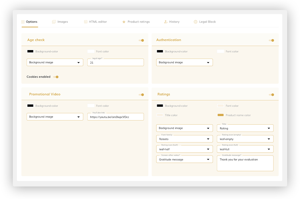
The Template Custom Page displays 4 sections in the Options Tab:
• Age check
• Authentication
• Promotional video
• Ratings
In this case, the Experience Info page is configured in the HTML Editor tab, to be able to design it more tailored to your experience
Age Check
Page for the user to validate their age and can continue to see the experience. For this page we can configure:
• Check ‘Age check’: to make this page visible or not in the experience.
• Background color—Indicates the background color of the page.
• Font color—Indicates the color of the letter.
• Background image: allows you to select as the background of the page an image of those added in the Images tab.
• Legal Age: allows you to indicate the legal age to be able to continue with the experience.
• Cookies Enabled: enable/disable the acceptance of cookies.
Authentication
Page for the authentication of the scan (page that only makes sense if you are going to create tags).
• Check ‘Authentication’: to make this page visible or not in the experience.
• Background color: Indicates the background color of the page.
• Font color: Indicates the color of the letter.
• Background image: allows you to select as the background of the page an image of those added in the Images tab.
• Font family: allows you to select a font for your text displayed.
•Successful authentication icon: Select an image from the images tab to display as an icon when the authentication is successful.
• Successful authentication text: Text to display on the page when the authentication is successful.
• Unsuccessful authentication icon: Select an image from the images tab to display as an icon when the authentication is not successful.
• Unsuccessful authentication text: Text to display on the page when the authentication is not successful.
• Continue button text: Text to display on the button to continue to the next page of the experience.
Examples:
• Check ‘Tamper type’: Select the “toggle” to activate or deactivate the Tamper Type to the right of “Tamper Type”. Tamper Tags are designed to detect and authenticate a packaged or sealed product.
When Tamper Type is active, more fields will appear, to configure the authentication page as shown below:
• Close Tamper Icon: Select an image from the images tab to display as an icon when the tamper tag has not been tampered with or open.
• Close Tamper Text: Text to display on the page when the tag has not been tampered with or open.
• Open Tamper Icon: Select an image from the images tab to display as an icon when the tamper tag has been tampered with or opened.
• Open Tamper Text: Text to display on the page when the tag has been tampered with or opened.
• Unknown Tamper Icon: Select an image from the images tab to display as an icon when the status of the tamper tag is unknown. Any manipulation of tampering of the tag cannot be detected.
• Unknown Tamper Text: Text to display on the screen when any manipulation or tampering of the tag cannot be detected
Examples:
Promotional Video
Page that allows you to view a video in the experience:
• Promotional Video: to make this page visible or not in the experience.
• Background color—Indicates the background color of the page.
• Font color—Indicates the color of the letter.
• Background image: allows you to select as the background of the page an image of those added in the ‘Images’ tab.
• Youtube Link: to indicate the URL of the Youtube video that will be displayed in the experience.
Ratings
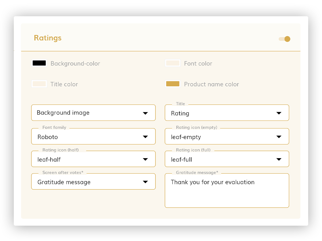
This block is only available for the Custom page template. It allows to visualize in the experience a popup for the final user to rate some aspects of the product or products that interest us.
The fields that are defined are:
• Background color: Indicates the background color of the “Pop-Up” page.
• Font color Allows you to indicate the color of the title.
• Title color: Allows you to indicate the color of the title.
• Product name color: Indicates the color of the names of the products that are valued.
• Background image: Allows you to select as the background image of the “Pop-Up”. These images must be added to the ‘Images’ tab in order to select for your background image.
• Title: Title to be displayed in the “Pop-Up”.
• Font family: Allows you to select a font for your text displayed.
• Rating icon (empty): icon that will be displayed when rating a feature in the rating popup. In this case it would be the empty icon: For example:
• Rating icon (half): icon that will be displayed when rating a feature in the Rating Popup. In this case it would be the half-filled icon. For example:
• Rating icon (full): icon that will be displayed when rating a feature in the Rating Popup. In this case it would be the filled icon. For example:
• Screen after votes: allows you to select what the popup screen will look like after the user submits their votes. You can choose between:
- Gratitude message: the popup will simply display a message thanking the user for his rating.
- Average rating: the popup will show the average of the ratings made by the users.
• Gratitude message: allows you to indicate the message that will be shown to the user after his evaluation. This field is only displayed when the Gratitude Message value is set to Screen after votes.
In addition, in the Product ratings tab (See 4.1.5. for more detailed information) the products to be rated by users are defined. The characteristics to rate the product for each one are configured.
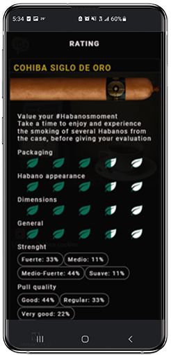
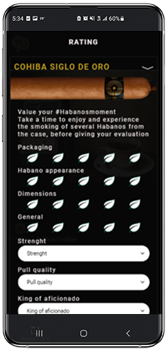
The Rating Pop-Up must be added via the HTML Editor. The Rating Pop-Up that will be displayed will be displayed as shown below: (taking into account the defined characteristics: colors, font type, backgrounds, ratings, etc.):
After sending the data, depending on the configuration, the screen with the average will be displayed:
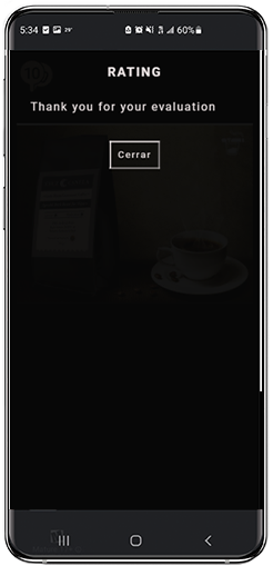
Or the screen with the thank you message:
Visible tab in any type of template. From here you can add all the images that are later used in the experience.
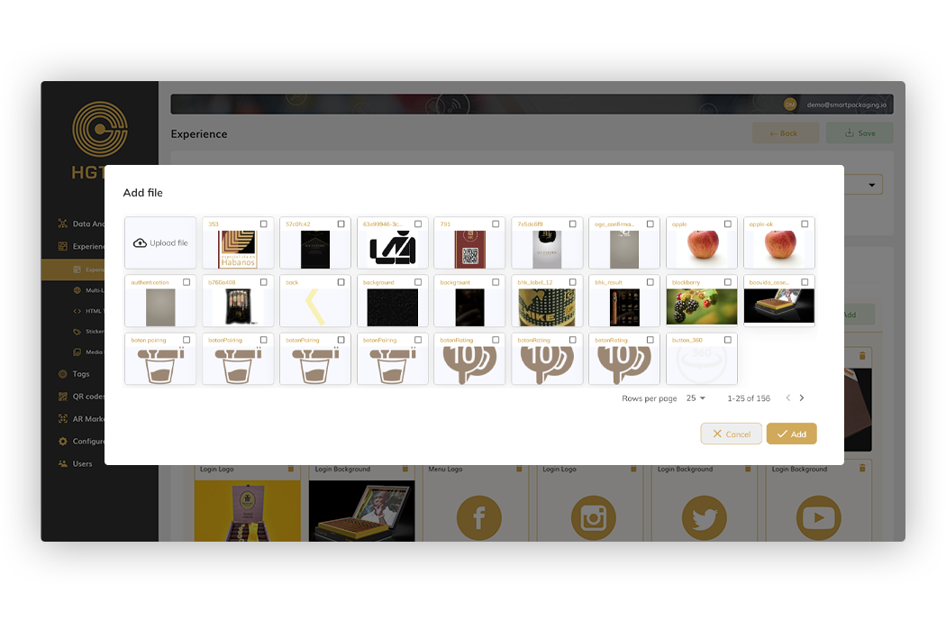
To add one or more images it is enough to press Add and a screen will be shown with the thumbnails of those images that we have in the Media Library section, being able to select one or several at the same time.
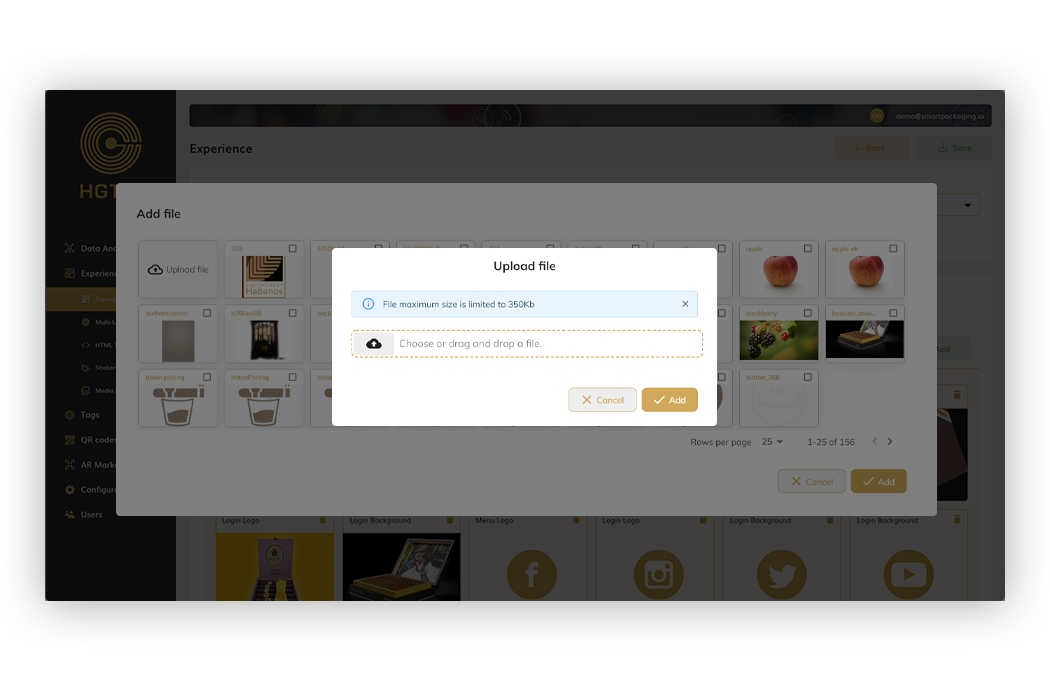
In case you want a new image that we do not yet have in the gallery, we can upload it by pressing Upload file and selecting from the browser or dragging and dropping.
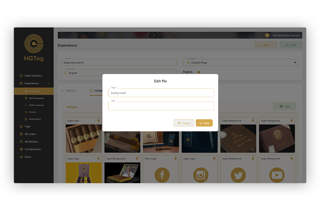
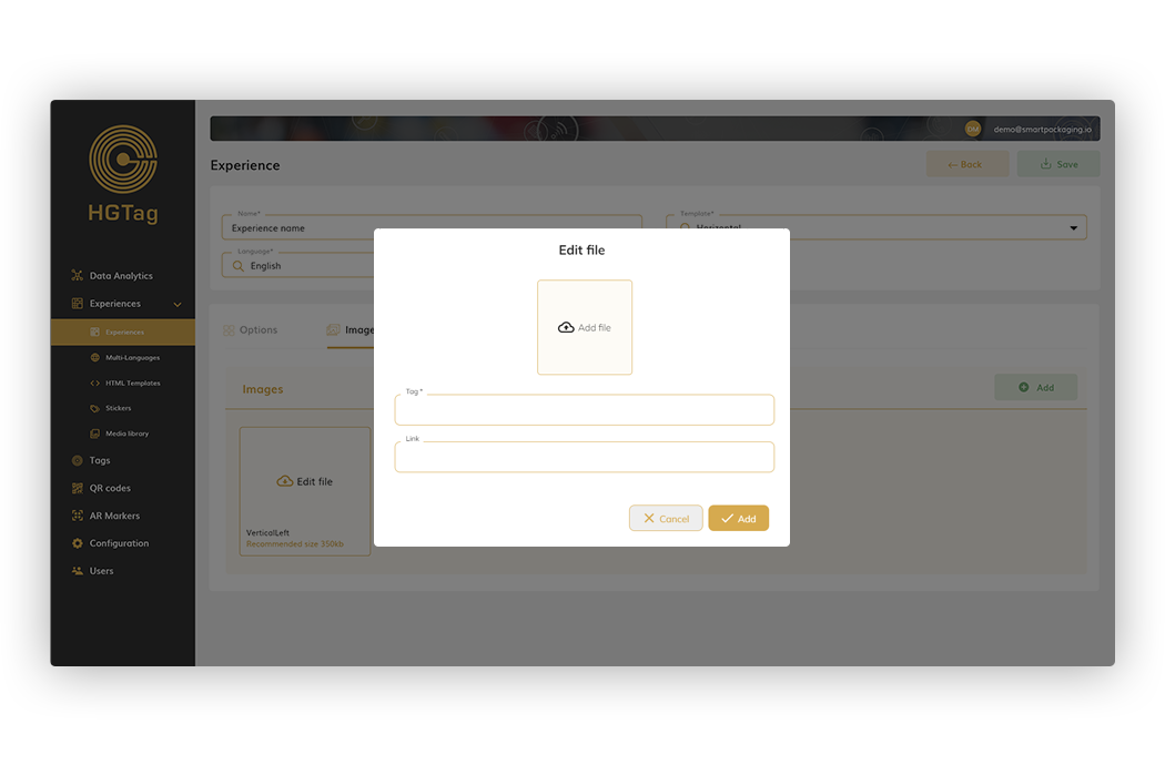
Once the images are uploaded, we can, for each of them, change the tag and define a link different from the one indicated in The Media Library. To do this you will have to click on the image and popup will open to indicate the values.
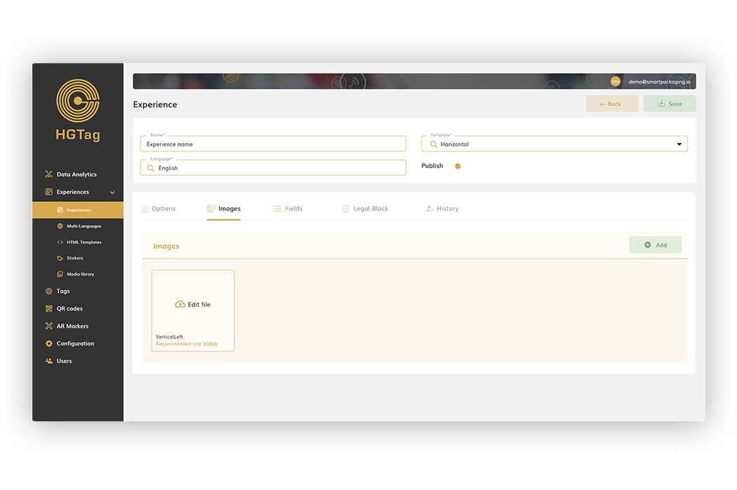
For the Vertical and Horizontal fixed templates, it is mandatory to indicate some images. In the case of the vertical template, it will be mandatory to add the image of Vertical Left.
And in the case of the Horizontal template, two will be mandatory: Header and Horizontal Divider:
To upload the images, you must click on the field and the screen will open to complete the necessary data: image, tag and link (not mandatory).
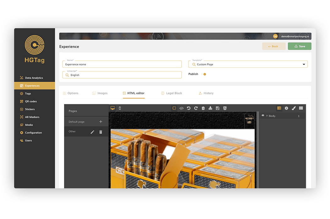
Tab only visible for the template Custom Page. From here you can make your own design of the experience page from an HTML editor.
You can also choose to disable the display of all pages of the Options tab (age check, promotional video) and design them all with the editor.
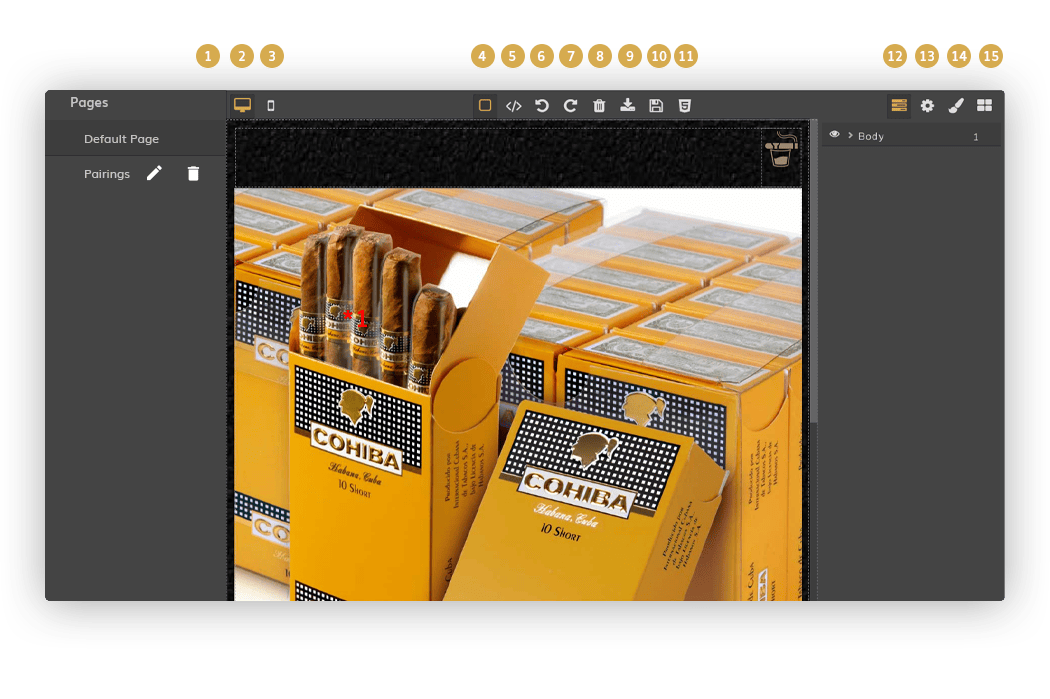
The following are the most important elements of the editor (the GrapesJS component is used), but any user familiar with HTML design will be able to edit pages easily:
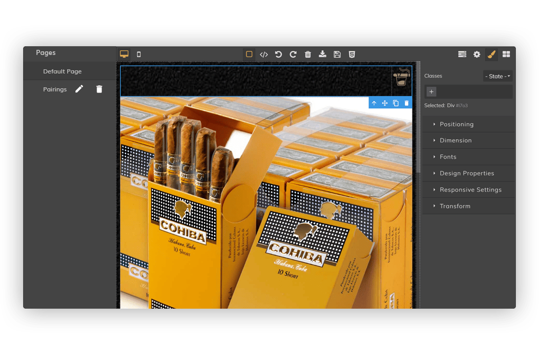
Pages (*1): From here you can add pages or delete . You can also rename the page with the edit button:
For the main page of the experience (Default Page) it is not possible to change the name.
Desktop view (*2): The design of the experience is displayed in desktop view. We recommend that you design in this view.
Mobile view (*3): The design of the experience is displayed in mobile device view. Once the experience is designed (in Desktop view), it is recommended to switch to this view to make the necessary adjustments to the items that are mismatched.
Border view (*4): shows the edges of each element added in the design, so that we can better visualize where each element is and design more easily.
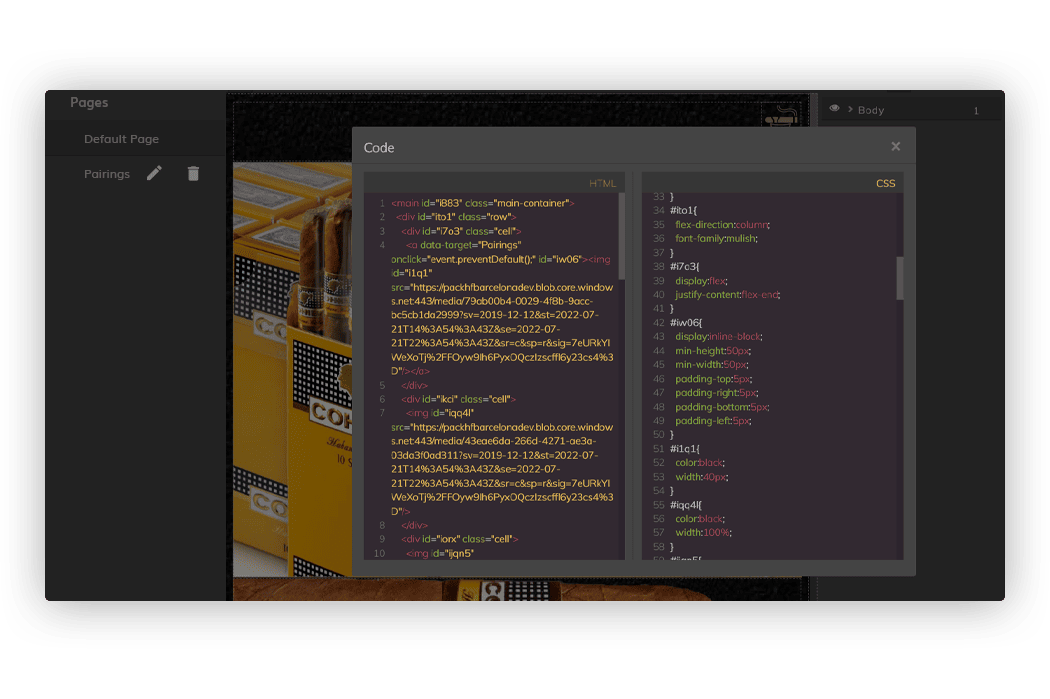
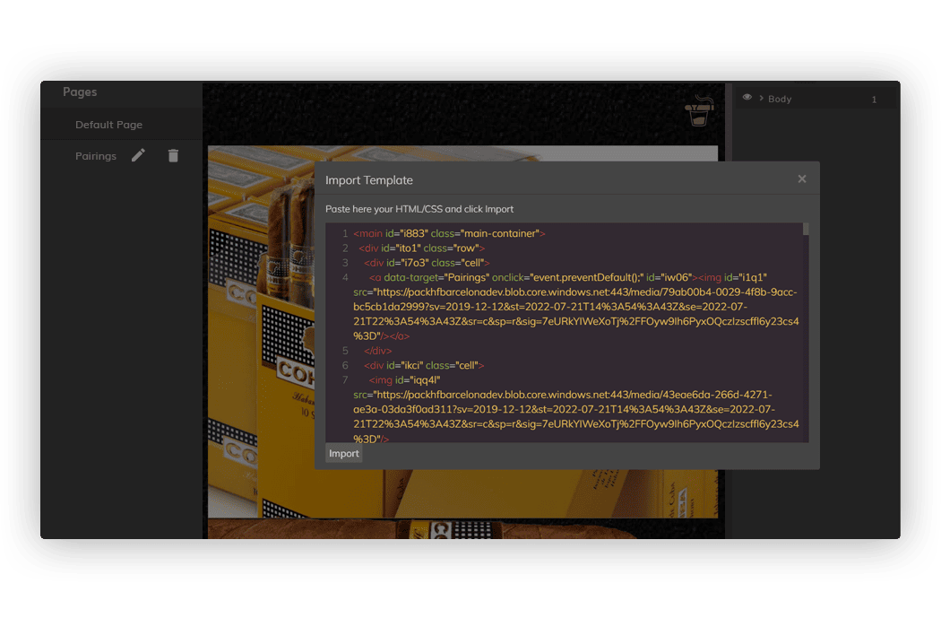
View code (*5): Displays in a popup the HTML code of the experience being designed. Example:
Undo (*6): to undo the last changes made.
Redo (*7): to redo the last changes made.
Clear (*8): to remove all the design made in the editor.
Import (*9): Allow you to import HTML/CSS code
Save (*10): to save changes made to the editor. Important! This save is from the editor (i.e. only design changes will be saved). To save the changes of the entire experience that we are configuring, we must then use the Save that we have in the header.
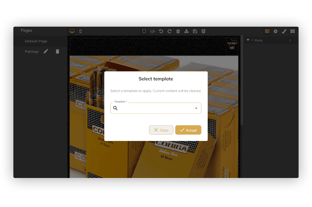
Select template (*11): allows you to apply a template that has been designed in the ‘HTML Templates’ section. By accepting, the template will be applied on the page where we are located and we can finish designing the page, adjusting textx and colors, applying images, etc.
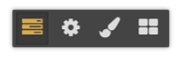
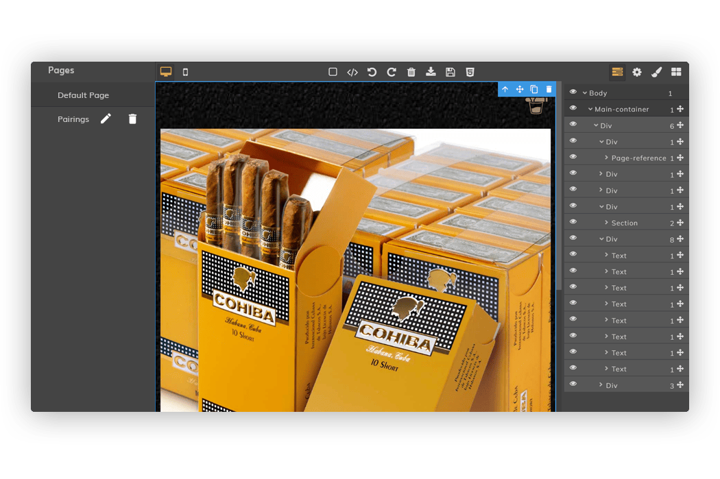
Layers (*12): section to display all the elements added in the design and its layers.
1. Example:
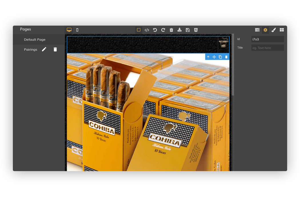
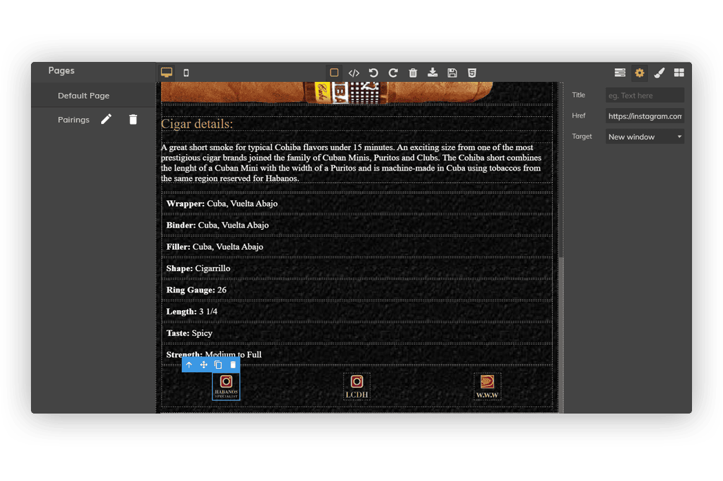
Settings (*13): section to display the configuration of the elements. Depending on the element, there will be some fields or others. For example, for the ‘Link’ element we have these:
Element styles (*14): section to configure the style of each element (alignment, size, colors, background… etc)
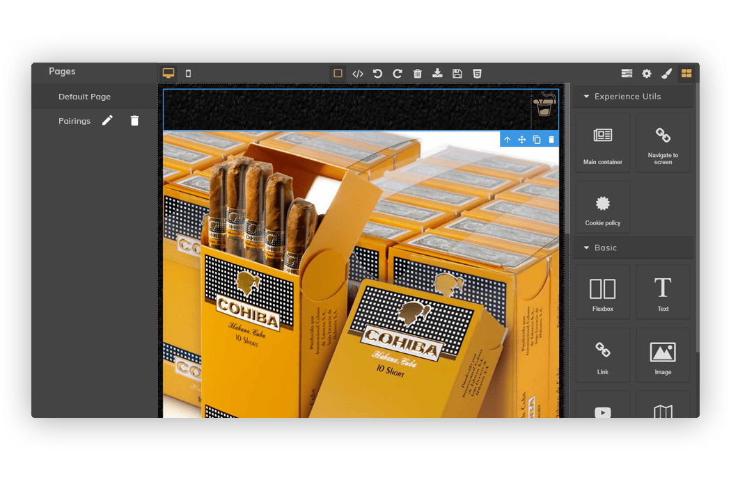
Elements (*15): section with the different elements available for the design of the page. Simply click on the one you want to add and drag it to the design page to include it.
Now we go on to detail the most important available elements of the design:
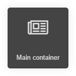
A container element for other items. It should always be used as the first element of the design, so that the rest of the elements will be dragged into it. This is done so that the properties that are indicated as the background color are displayed correctly.
Element that allows you to navigate to another page of the design. In the settings you have to indicate which page you want to navigate to. In the drop-down the name of the different pages that have been created will appear.
For example, we are on the Default page page and we want to navigate to the Other page, so in the Page field of the settings we will indicate Other.
Comment that within the element Navigate to screen it is recommended to include an image or text, as you want to design.
Element that allows to include the cookies policy. Clicking on it will open popup with the detail. Within this element it is recommended to include an image or a text.
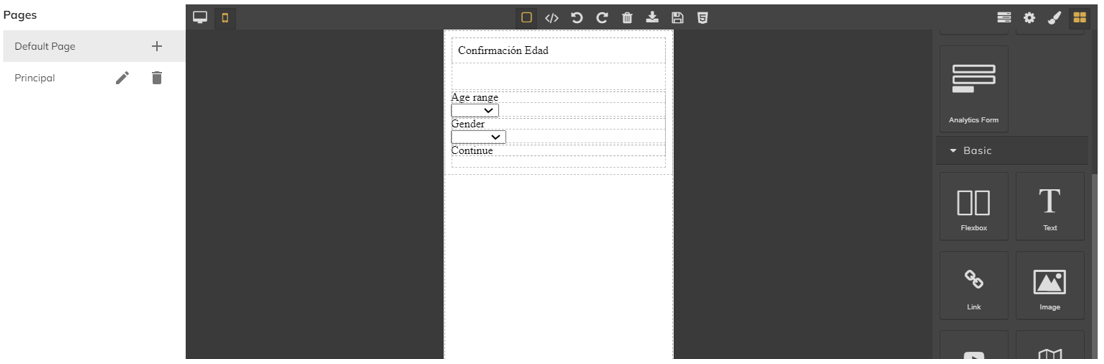
Element that directly adds a form with the age range and gender fields:
These fields are intended to be completed by the user, in order to continue with the experience. They must be of legal age in order to do so. These fields will be registered and displayed in the dashboard of your back office. This information will be included in the data analytics section.
The Drop-Down fields included in this form can be customized. This includes the value of each field, as well as, its position of each field, its color, font, etc…
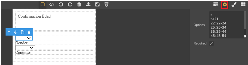
In order to see and adjust the values of each Drop-Down field, you must first select the field, and click the ‘Setting’ tab:
You can change or add more values in the ‘Options’ field.
Important Points:
- You must directly input the value, or number, that defines a ‘Minor’. In the case that user under 21 years of age is considered a minor and cannot view the experience, you would input the following values:
- First add :: , without any identifier.
- Then, ::<21
- For the rest of the values, you must indicate a unique identifier, then :: , followed by the text to be displayed as the next ‘age group” for the user to select. For example:
- 22::22-24
- 25::25-34
- 35::35-44
- Make sure that ‘Required’ section is checked, which will make this mandatory for the user, in order to proceed with the experience.
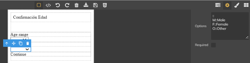
For the Gender parameter, the value configuration works the same, but in this case, it is not mandatory to check the “required” if we do not want to force the user to enter this value.
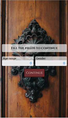
Below is an example of how an Age Verification page will be displayed:
Flexible Box that by default includes a row with two columns. Within the columns you can drag other elements such as link, texts, icons, etc.
An element that allows you to include a text.
Element that allows you to include an image.
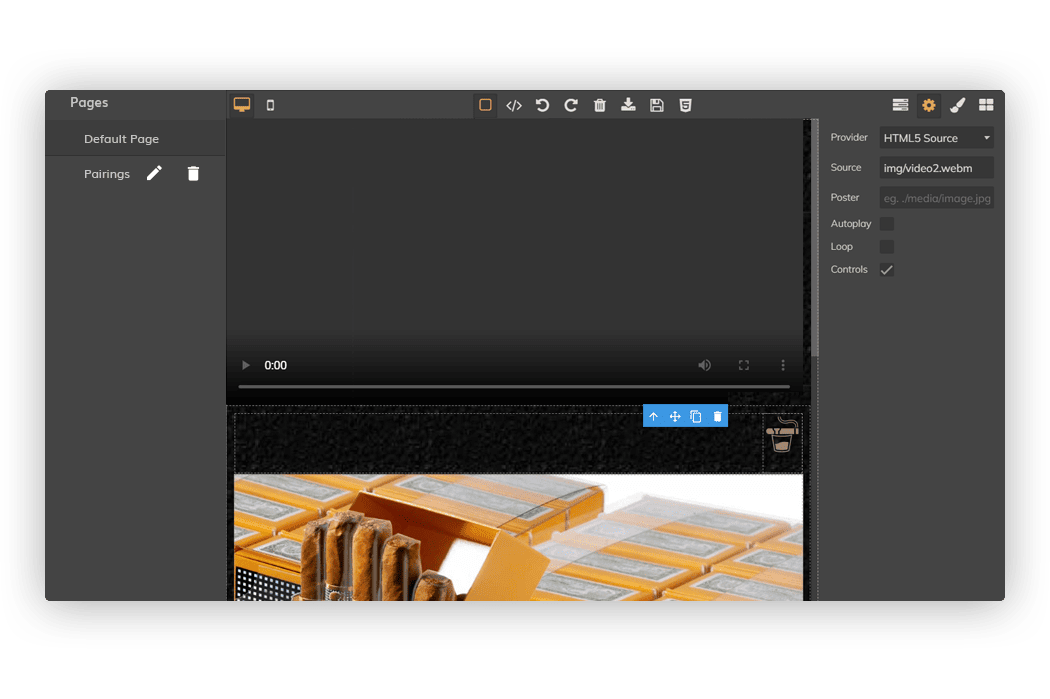
Element that allows you to include a video in the experience. In the settings you must first indicate the provider (html5 source, Youtube or Vimeo) and then, depending on the provider, the rest of the necessary data such as the ID, if it plays automatically, etc:
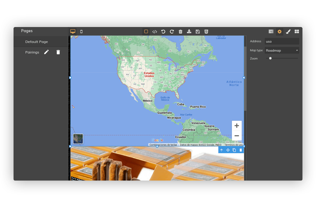
An element that allows you to include a map. In the settings you can configure an address (municipality or exact address), the type of map and the zoom you want.
An element that allows you to insert HTML code in the position where the design is dragged.
An element that allows you to insert a button. After dragging it, you can change the text, color, size, etc.
An element that allows you to add a link to another external page. In the settings you must indicate which page you want to navigate to (Href field) and if you want the page to open in a new window or in the window itself (Target field).
Comment that within the element it is recommended to include an image or text, as you want to design.
The adjustments of the elements are available in the section Element styles, as we have mentioned above.
From here you can change the size, position, colors, type of font, margins etc., depending on the element we have selected.
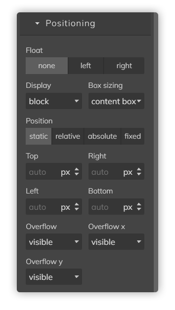
With the properties of Top, Botton, Right and Left we can modify the position of the element.
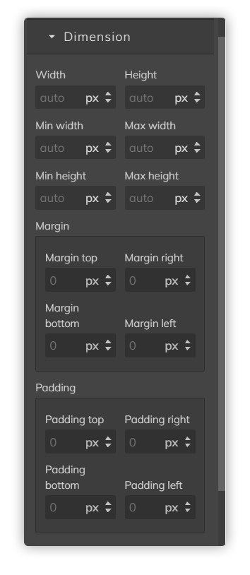
With Width/Height we can adjust the size of the element. By clicking on px you can change the measurement from px to % (recommended for Image element) or vw. Indicated min/max width or height we can limit the minimum/maximum height/width of the element. Margins can be controlled with Margin properties.
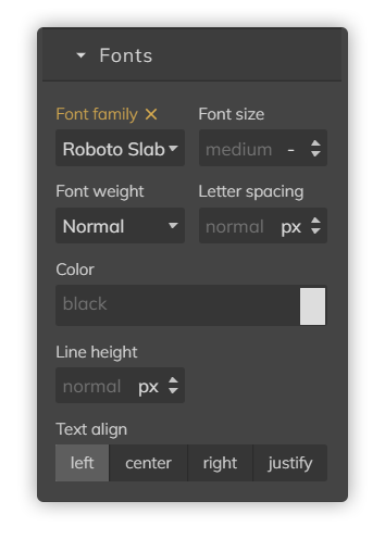
We can adjust the font, size and thickness of the font with Font Family, Font Size and Font Weight, respectively. Also change the spacing with Letter spacing or color. Also, the alignment with Text align.
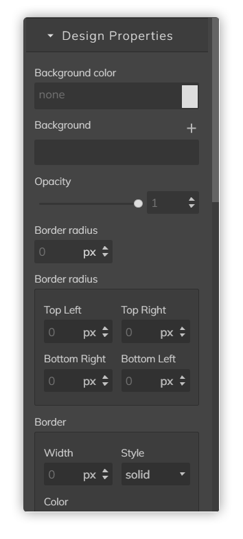
From here we can change the color of the background of the page (background color) or even add a background image (background property, using the +). You can also add a border and configure its color and size.
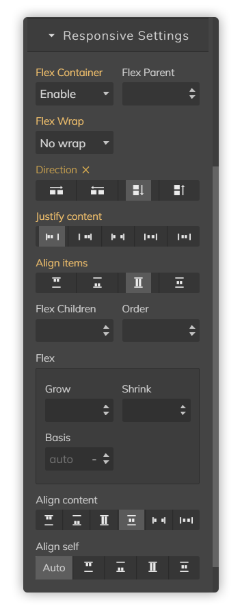
Properties to review/configure when the selected item has been set in General as Display=flex. The Flex property is a property that indicates the ability of a flexible element to alter its dimensions and fill the available space.
Another important property is Flex Wrap. Here it is specified whether the children elements (elements within the element we are configuring) are required to remain on the same line or can flow on several lines. If wrapping is allowed, we can also use the rest of the properties to control the direction in which the elements will be stacked.
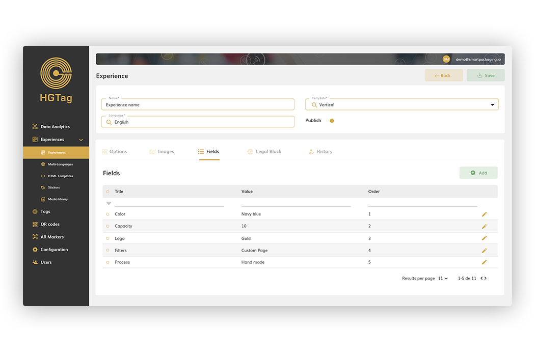
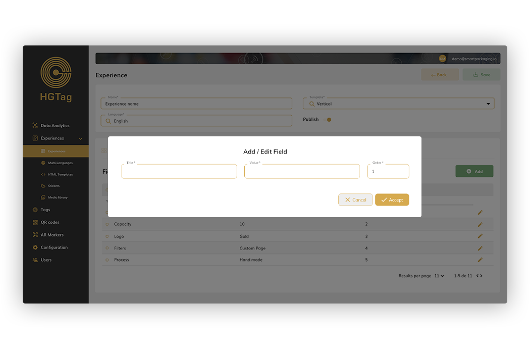
Tab only visible for the Vertical and Horizontal templates. From here it is allowed to add and configure informative fields that will be displayed on the Experience Info page
To add new fields you have to press the Add button and for each field you must indicate:
Title: The title of the field.
Value: value/description to display.
Order: order in which the field will be displayed (we can add from 1 to x).
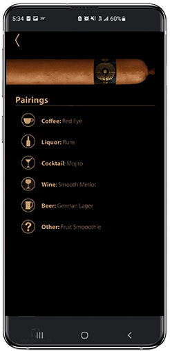
This setting, on a mobile device would be displayed as:
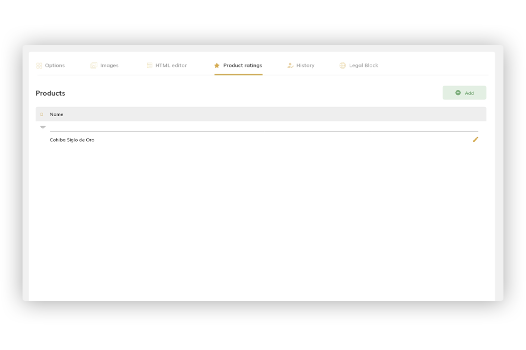
This tab is only visible in the Custom Page experience template. From here you can define the different products that you want to assess and what characteristics you want to score for each.
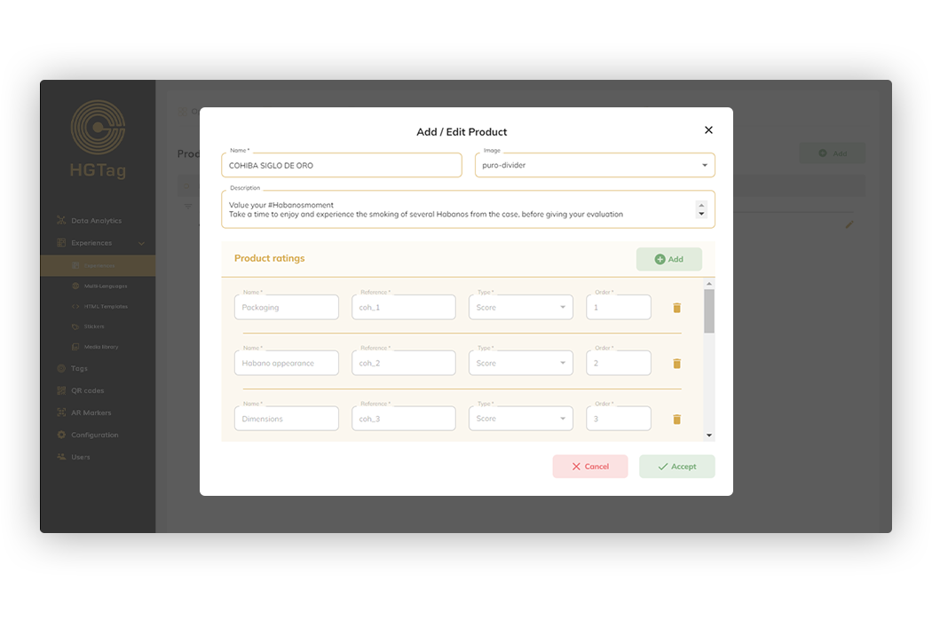
To register a new product, we will use the Add button and if you want to edit an existing one we will click on the Edit icon of the corresponding line. In both cases, the fields to be defined are:
• Name: Product name. It is a required data.
• Image: Product image. If one is indicated, it will be displayed below the product name in the rating popup.
• Description: Product description. If indicated, it will be displayed below the defined name and icon.
In addition to the 3 fields indicated, we have the Product ratings block where we define the characteristics that we want the user to value. We can add and edit or delete (in case you have not rated on this feature). For each “product rating” we have:
Type score:
• Name: Name of the feature to be assessed.
• Reference: The identifier of the feature. It must be a unique value. This helps us to then analyze the different customer ratings linked to an experience.
• Type: We can have two types.
- Score: will display 5 stars (or the icon defined in the Options tab) to rate that feature.
- Selector: Will show a drop-down with X-Values for the user to select the one that best suits their rating.
• Order: The order in which the feature will be displayed in the ratings popup.
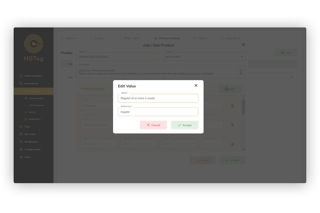
• Values: this field is only displayed with the type Selector. Here we define the values that we want to be displayed in the drop-down. Clicking on each value will open popup to edit the name and/or reference (unique identifier).
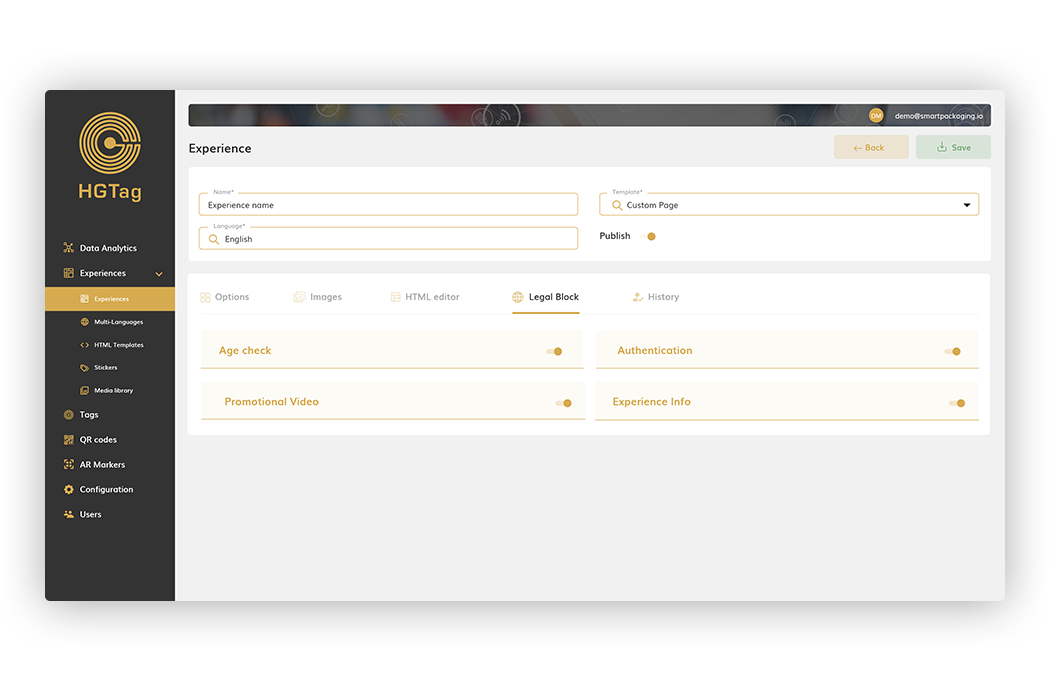
Visible tab in any type of template. From here you can adjust the visibility of the different pages of the experience when there is a legal blockade in the country from which the experience is being scanned.
The values that are configured, by default, are those indicated in the Legal block tab of the Configuration section, but they can be adjusted for each of the experiences.
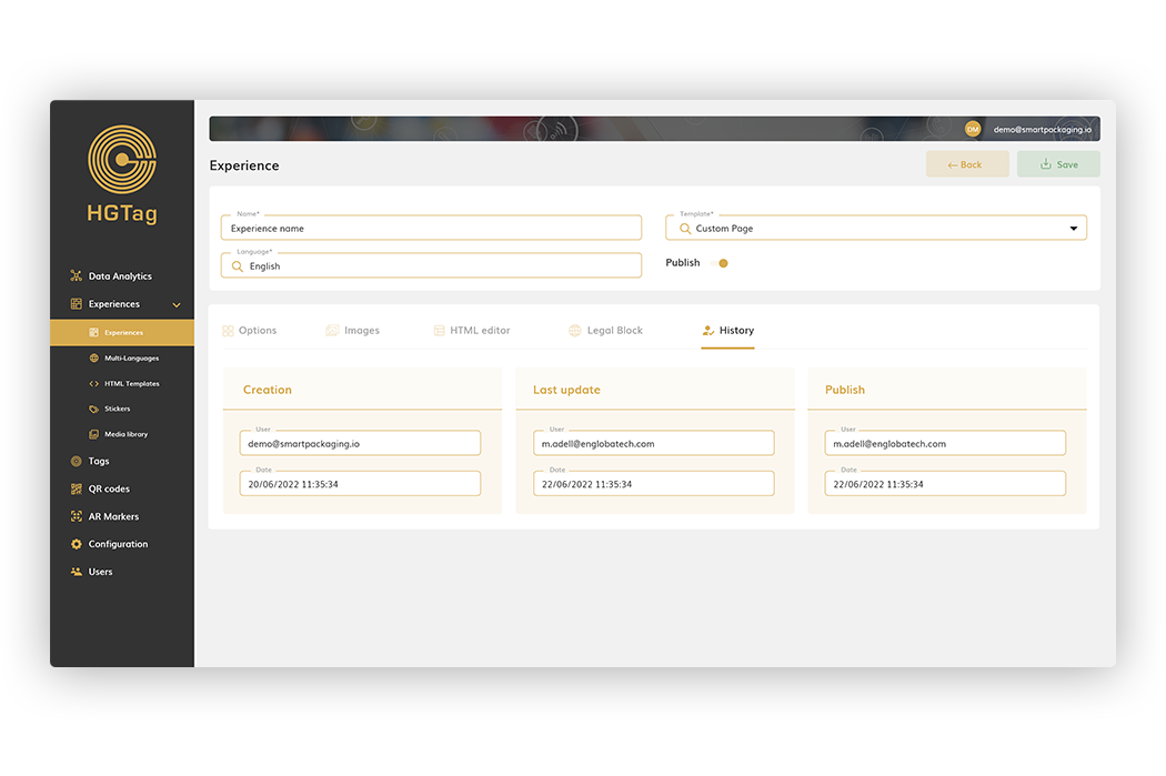
Tab visible in any type of template. From here you can view: user and date of creation, user and date of last modification, as well as the user and date that marked Publish the experience:
To delete one or several experiences, select them with the check field and press the Remove button:
The check only appears in those experiences that can be deleted, that is, those that do not have associated Tags.
If it is allowed to delete experiences that have QR associated. In the case of deleting it, all the analytics associated with the QR of the experience will be deleted and cannot be recovered.